Jordan Vernon

2024 Q2
portfolio

Overview

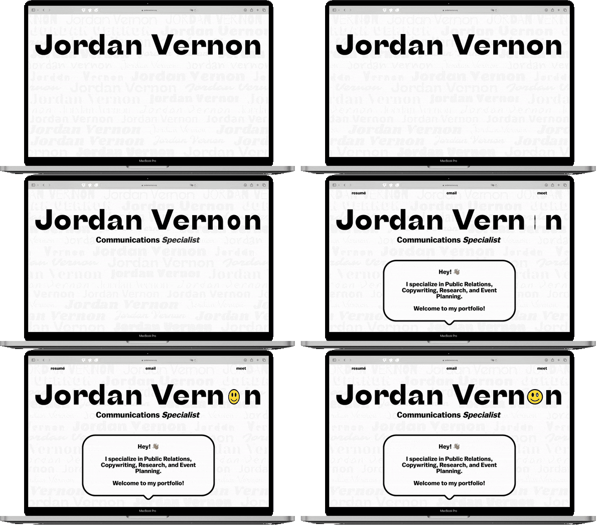
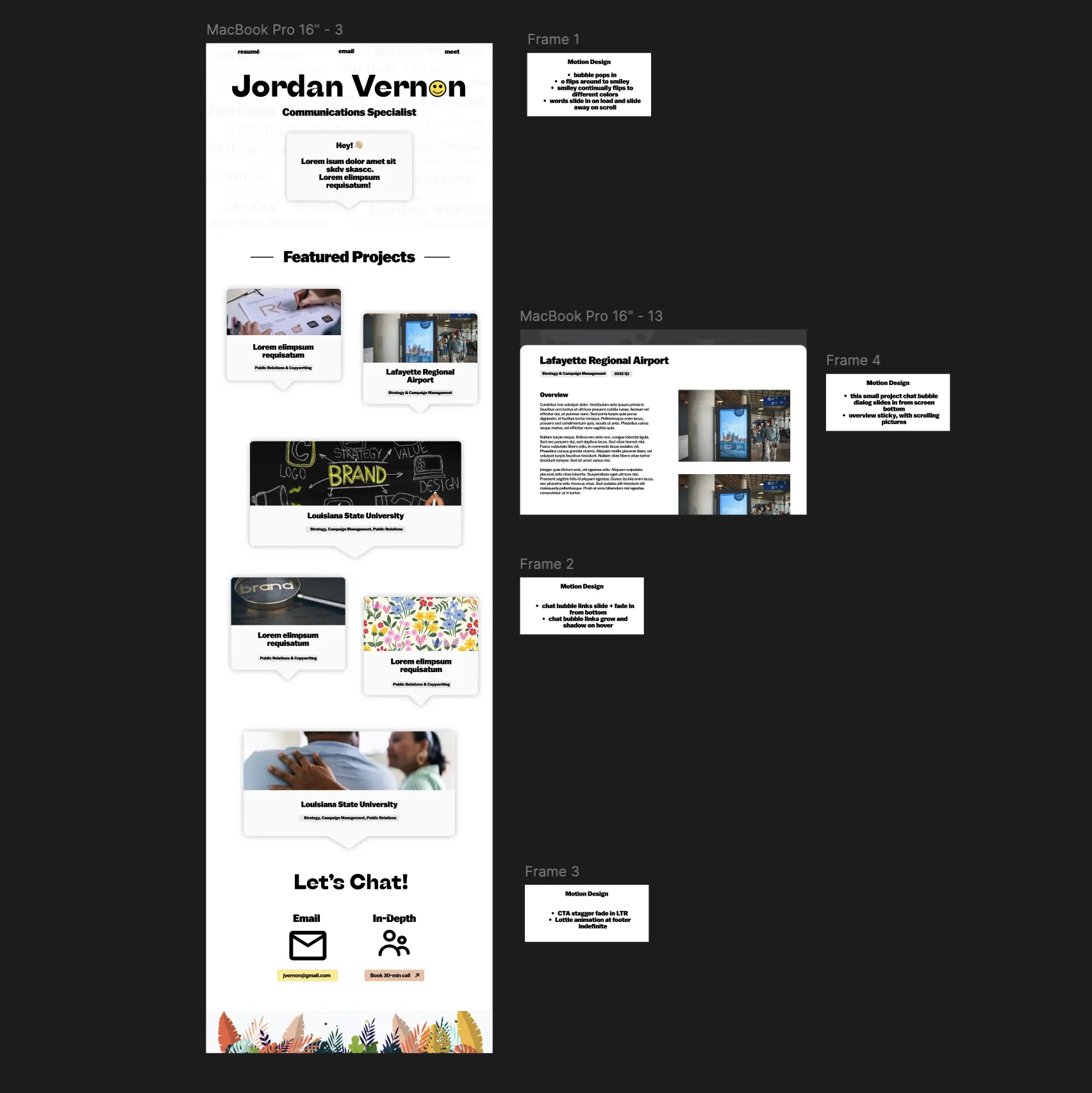
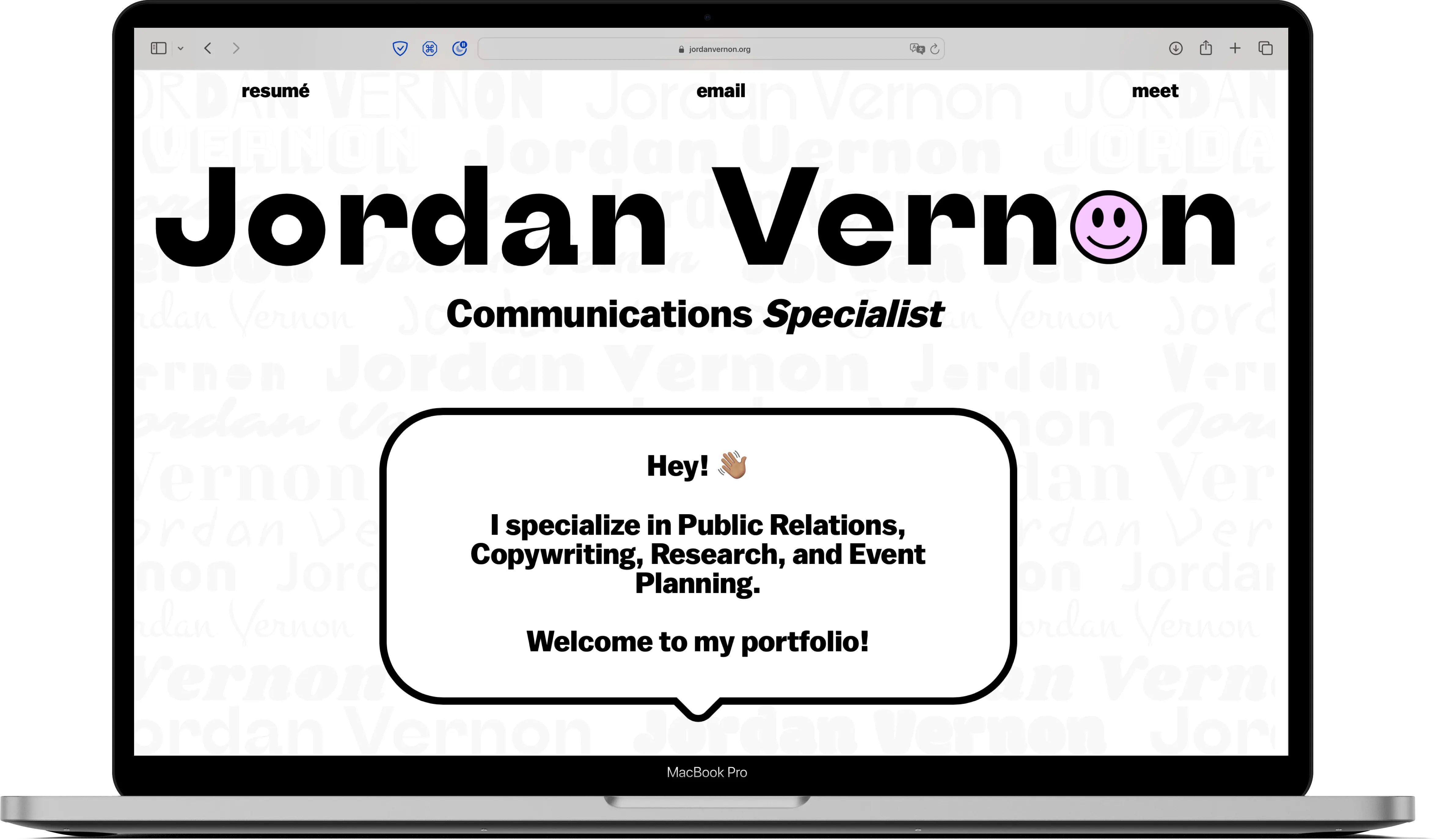
Jordan Vernon is a young professional with a bubbly, creative personality who needed a website to reflected that. She has experience in Event Planning, Community Management, Social Media Content Creation, Public Relations, and Research - truly being skilled in nearly every facet of Mass Communications. I leaned heavily in the "communication" aspect of her background, opting for a chat theme throughout the site.

My Role

pencil and ruler
UI Design
person beside a checkmark
UX Design
Development

scroll for more

Needs

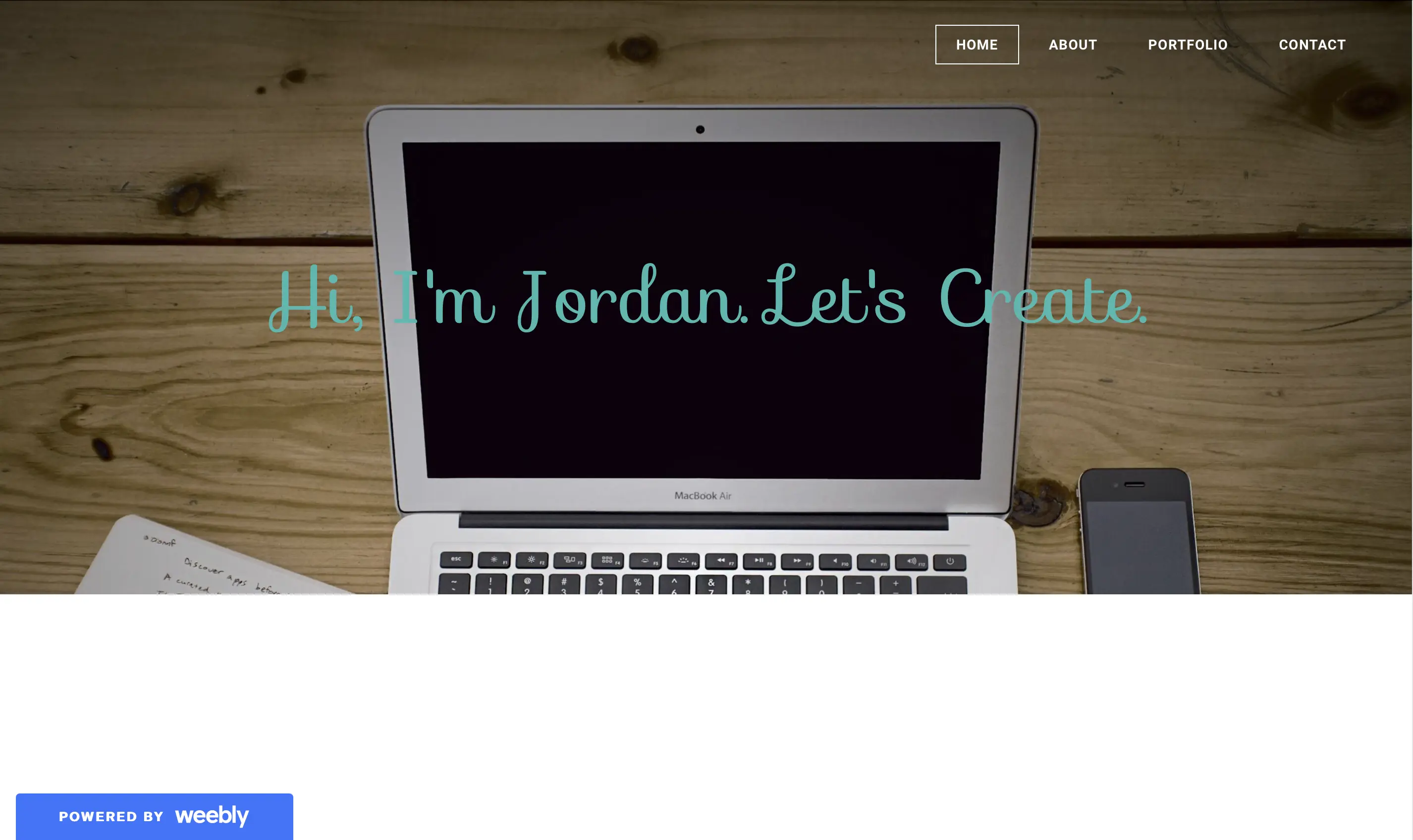
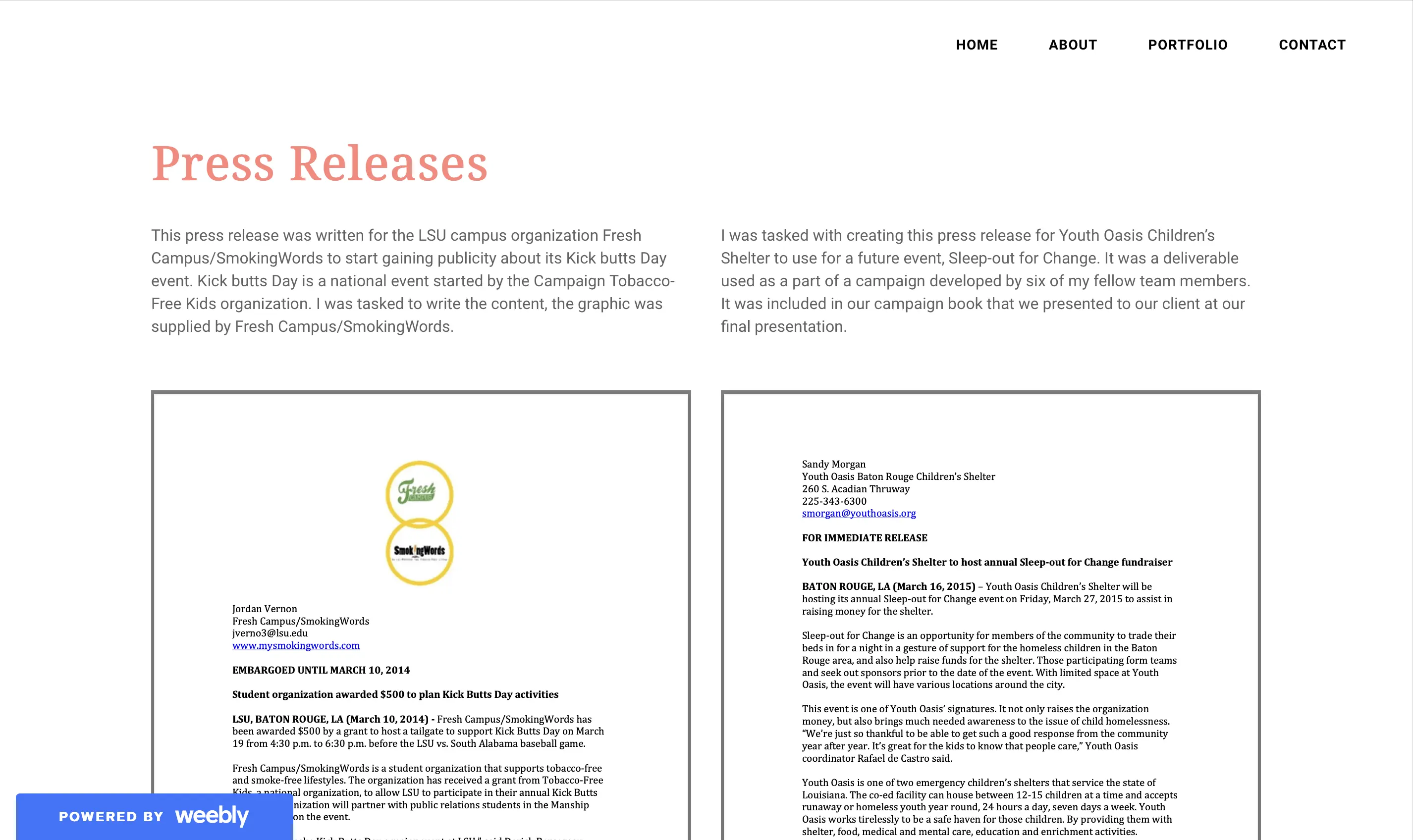
Jordan's previous website was made at least a decade ago, using Weebly - I don't even know what that is!

Needless to say, it needed a complete overhaul. Most of the sections were just a bit bland and straightforward. Great for conveying information, but not so great for conveying personality. I chose a custom design and code solution, of course, because she is a people person - any kind of cookie cutter template would just feel very inauthentic.

production credits featuring DreDidDat!

Personality

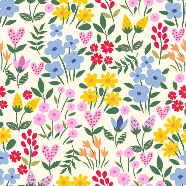
Whether innate or learned, Jordan is a bubbly people-person. We definitely needed to work in pops of color and personality throughout the website the keep things interesting, yet still professional to recruiters. She loves springtime colors and cohesive themes, so my design idea of "chatting" was well-received. She also is an "idea person" and a wearer of many hats in her work, so I wanted to let those aspects shine through.

Process

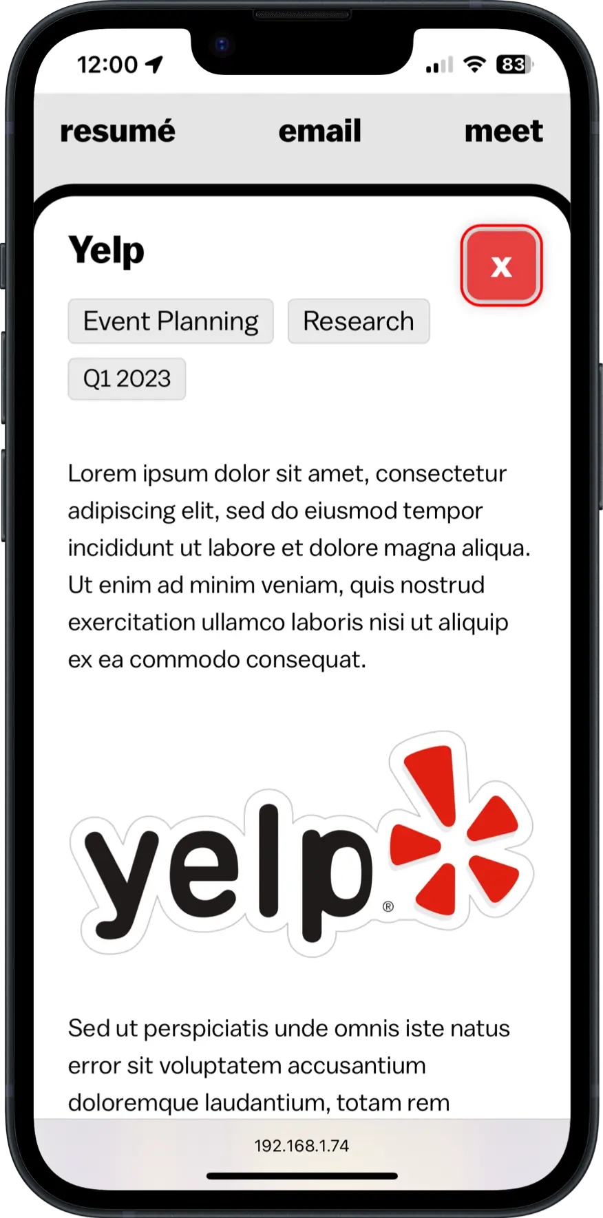
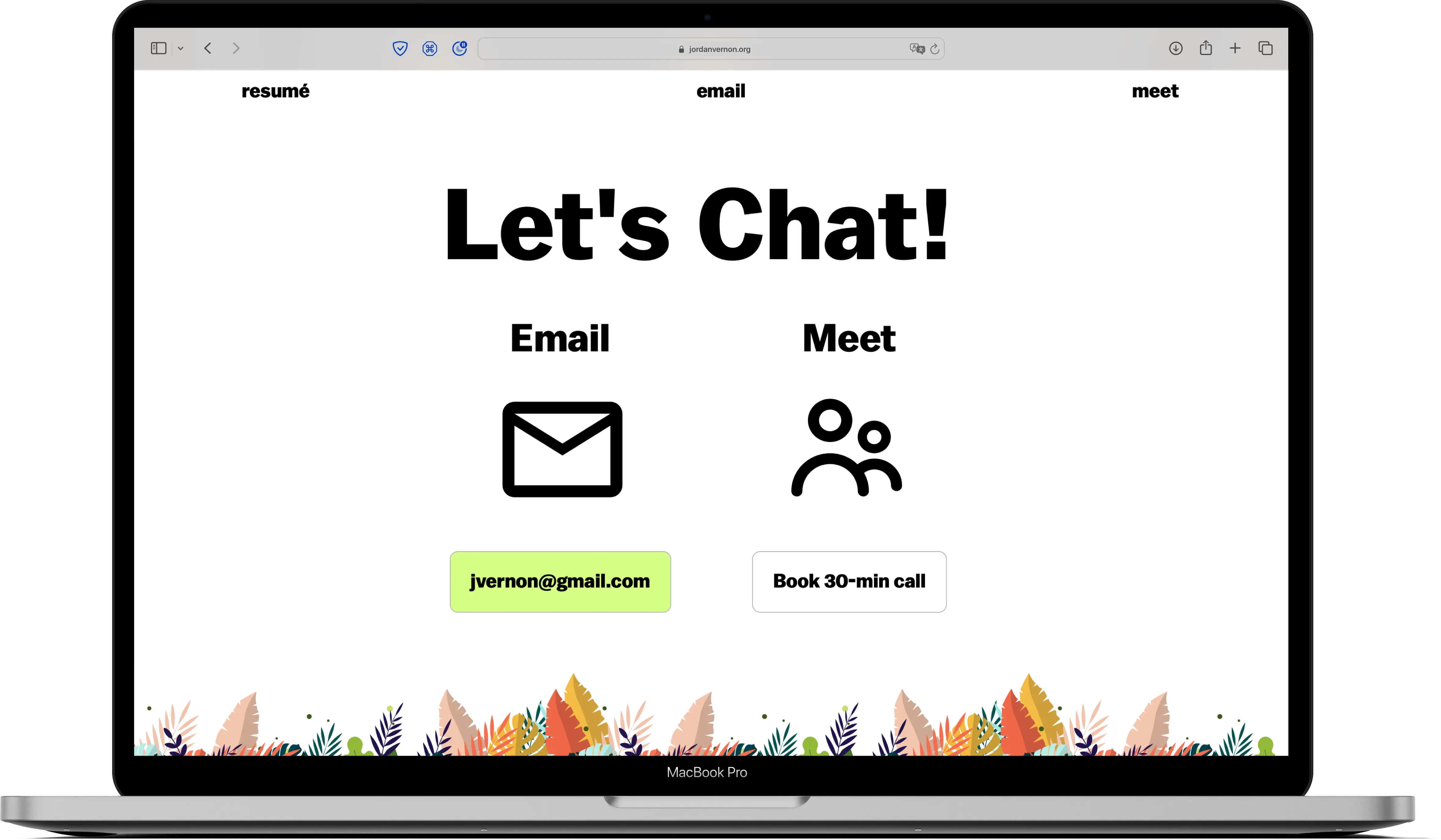
I decided that a one-page website would be sufficient for this project. The motion design is mostly subtle, while emphasizing the chat bubble theme. Bubbles pop into view as you scroll, and clicking any one of them triggers the main dialog bubble to pop in for the case study read through. JavaScript swaps out the content in the main dialog to keep the page light. I used a tool new to me - Lottie files - for an animated flowerbed flowing in the wind down at the end of the page.

Conclusion

A wonderful change of pace - creating a more artistic type of website for a younger client. We were able to execute more creative ideas that showcase both of our personalities. I look forward to more projects like this.

Home