A Place in Zion

2024 Q2
non-profit

Overview

A Place in Zion is a non-profit that's changing the dynamics of communities by providing love and resources to two often neglected groups. Their dementia care program offers assistance to caregivers who are in need of knowledge and strategy to improve quality of life for their seniors, and, their youth engagement program aims to create positive, loving, safe environments and engaging activities for young people to participate in.

My Role

pencil and ruler
UI Design
person beside a checkmark
UX Design
pencil drawing a line
Copywriting
Development

scroll for more

Needs

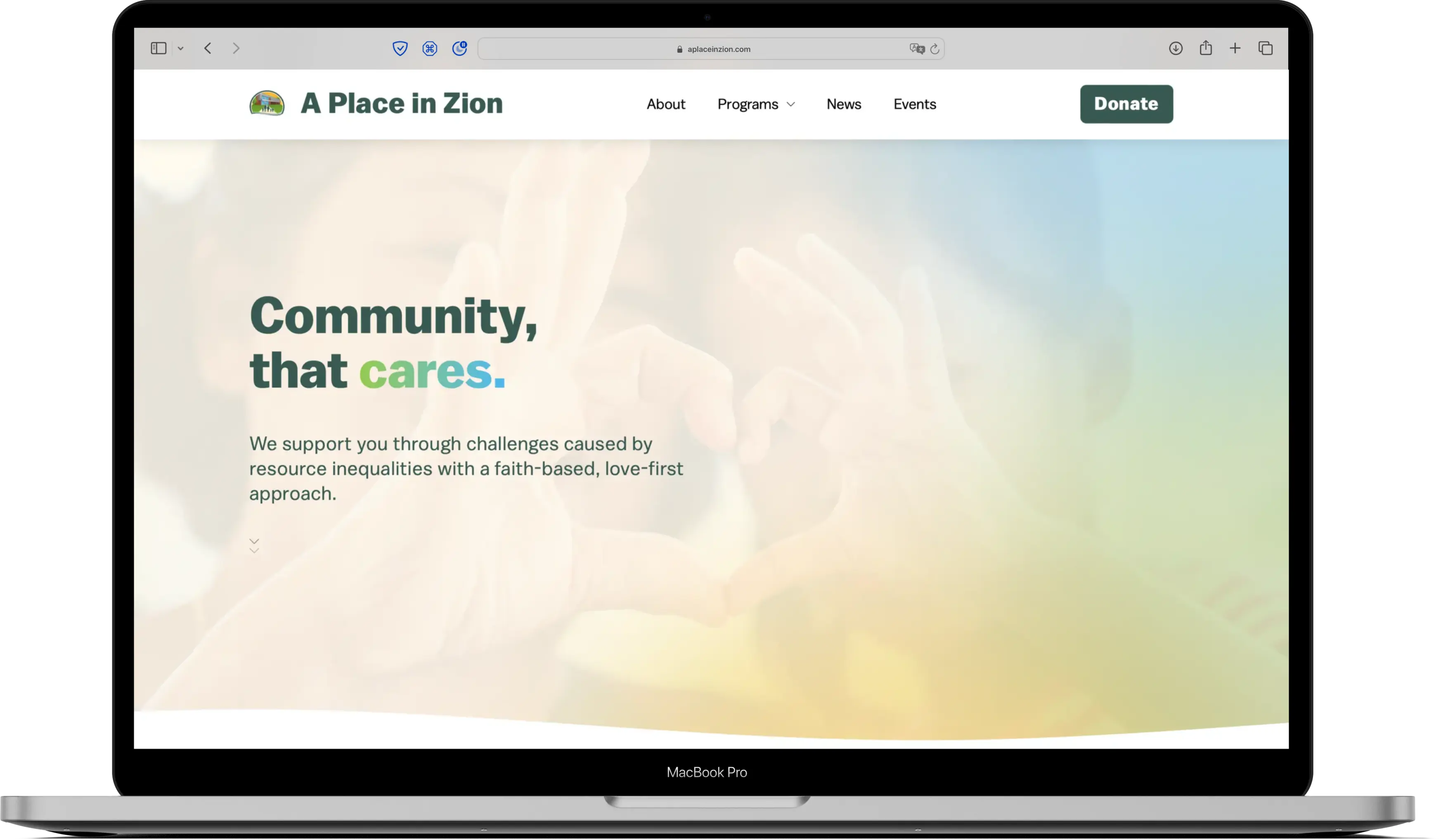
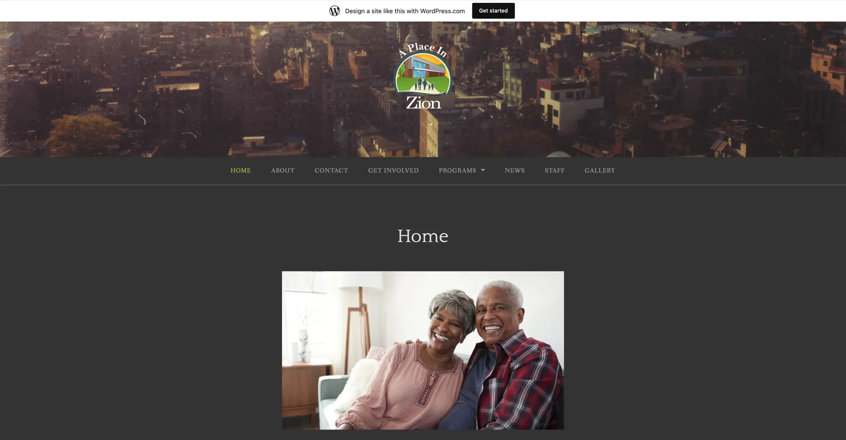
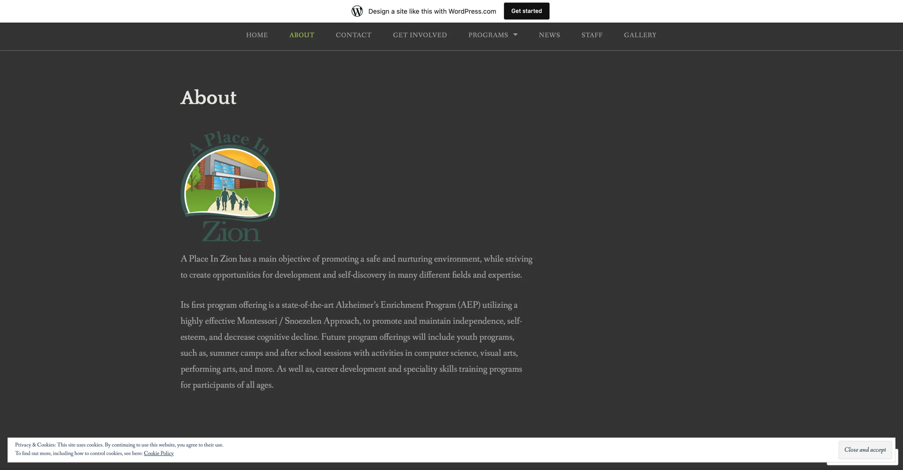
Getting started in 2021, A Place in Zion has a pretty short history. They came in with a preexisting website, logo, and business plan. Through a brief digital audit, I determined that their logo was good, but the other items needed tweaking or, in the case of their existing website, a complete overhaul.

I worked with stakeholders to determine the most important needs: a website with form captures and updated content.

production credits featuring DreDidDat!

Brand

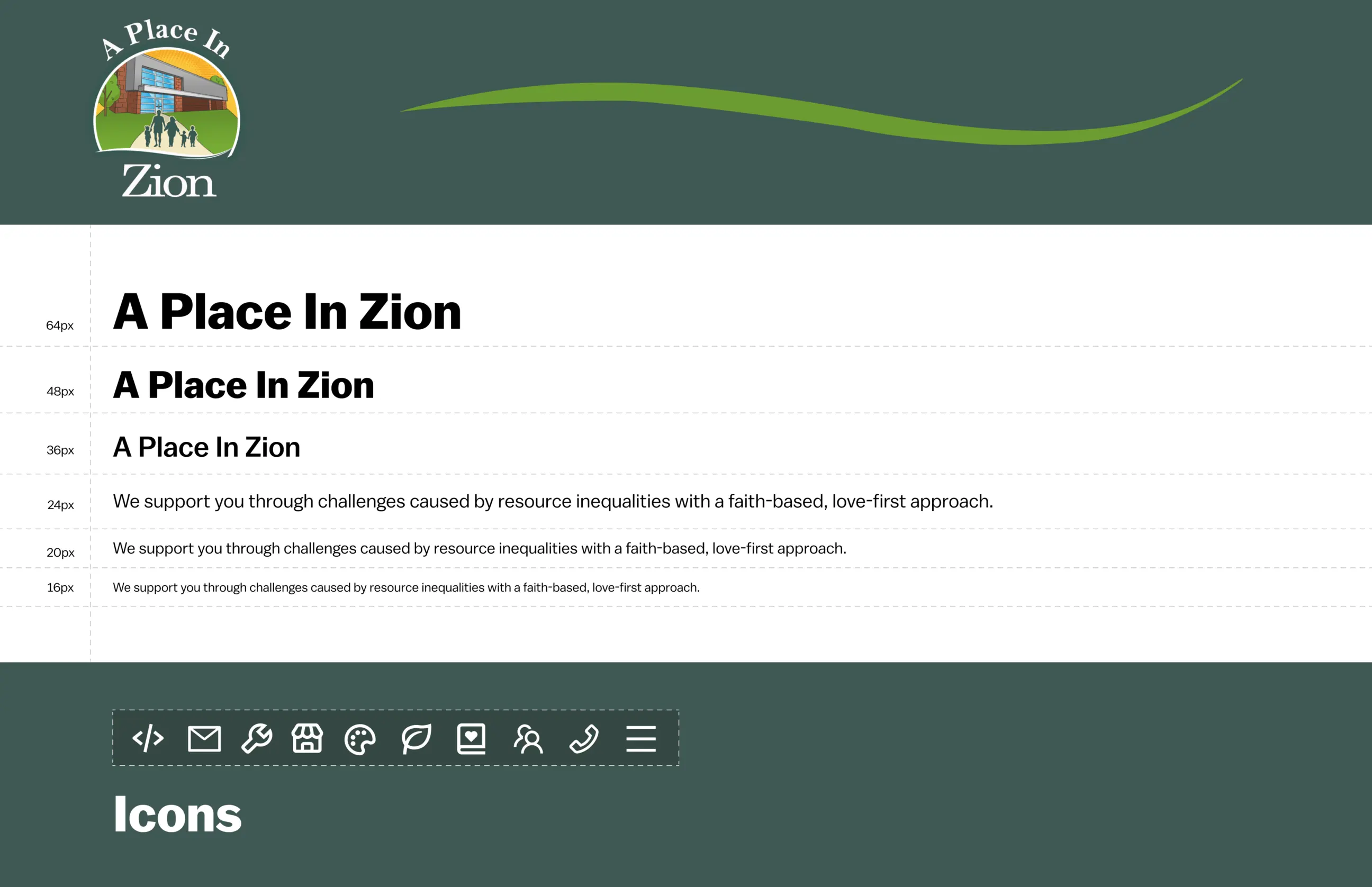
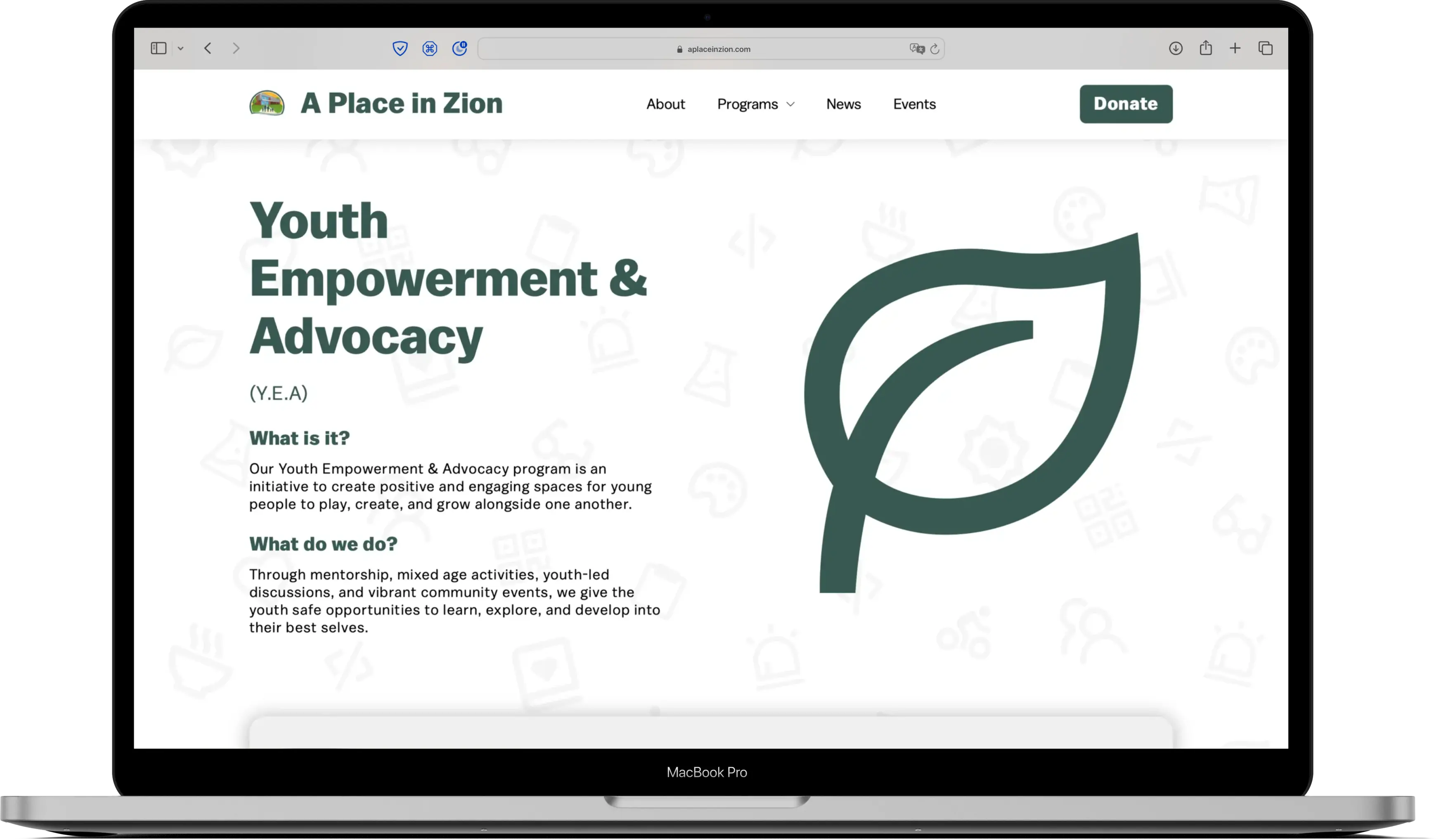
With a solid existing brand, I did not have to reinvent the wheel. Studying with their logo and a few of their flyers from past events led me to extrapolate a rich color palate for their website and brand as a whole. I used a calm sans-serif font alongside thick, yet soft icons that give the brand an artsy and inviting feel, but not childish or unprofessional.

Process

Our timeline was sped up to go live on GiveNOLA day - a wonderful opportunity for non-profits to "advertise" and have whatever donations they receive that day be matched by GiveNOLA. This presented a great challenge that was fun to beat.

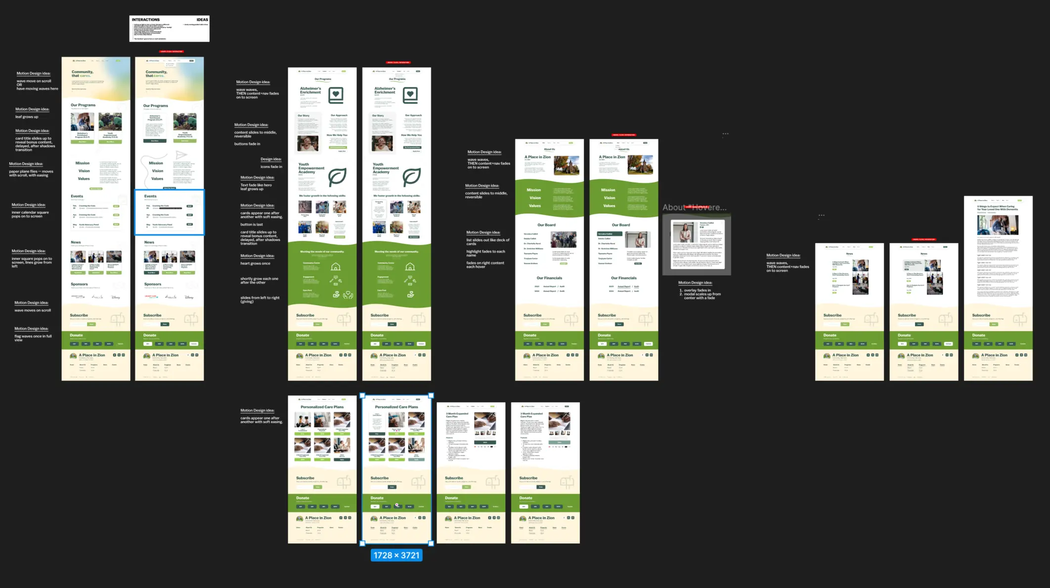
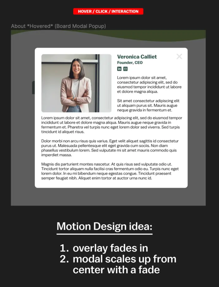
I started in Figma, creating a high-quality wireframe for each page of the site in our chosen design style. In addition to this, I created duplicate pages for each in order to plan out the interaction and motion design. Once the design was complete, I took the opportunity to teach myself HTML, CSS, and JavaScript in order to build exactly what I designed and exactly what my client needed.

Conclusion

This was an intense, comprehensive project that I'm very grateful to have completed - and for such a great cause. For a growing organization, having a beautiful, professional website will take A Place in Zion as far as they are willing to grow. I am also grateful to be along for that ride, because the future of this website and organization is destined for greatness.

Home